Form Builder
The Form Builder tool allows you to create, edit, delete, and manage forms and pop-ups in a WYSIWYG way. Creating a form is as simple as defining basic form information, choosing which questions/fields will be included on the form, selecting which products and/or packages you want included in the form, and then designing the look and feel. You can also add a thank-you e-mail and message to your form. When a user completes and submits a form, all of the demographic and transaction information from the form is saved in the ONEcount database, and any transactions that are captured by the form are immediately stored in the ONEcount database.
What is unique about the ONEcount Form Builder is that questions, products and packages are not defined in the form, but elsewhere in the ONEcount system. This allows your organization to have some level of control over the information and data collected by the forms, while allowing any qualified user to build and edit forms. The presentation layer–the form–is separated from the data layer, meaning your web designer can't change field options or the business logic behind your products and packages.
Questions are shared among ALL forms, so any changes made to question type, text, responses, alias, report header (See Question Builder - Create and Manage Questions for more detail) will change ALL forms, not just the form you are working on. Deleting a question will remove that question from ALL forms as well.
Changes made to form information, form layout, order of questions, and optional validations are form-specific and will NOT universally change forms; these changes will be applied only to the form you are working on.
Form-related tasks include:
- creating database fields/questions available for placement in online forms; (See Questions - Create and Manage Questions for more detail.)
- creating new forms;
- managing existing forms;
- creating source codes that are used to track the source of a name/transaction;
- and creating individually branded, designed forms.
The first task listed above – creating questions is accomplished by clicking the Demographics tab under SETUP on the left-hand men. The next two tasks – creating new forms and managing existing forms – are carried out using the Form Builder tool under SETUP Creating source codes is handled under Source Codes and creating branded forms is handled under Brands. All of these tools are found under SETUP
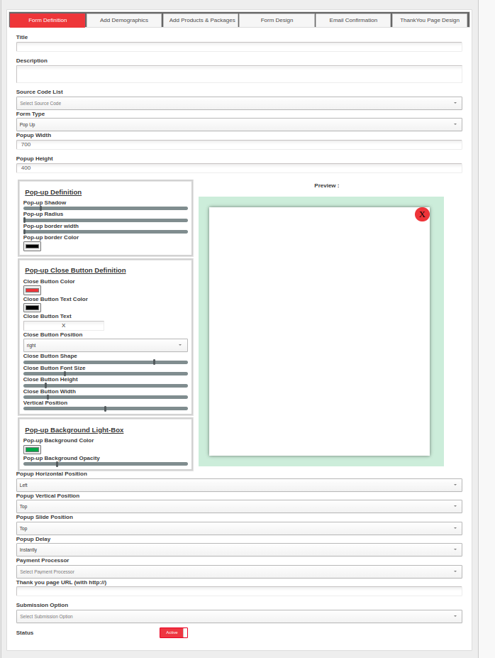
STEP 1: Defining the Form
The first screen you'll see in the Form Builder is where you define the basics of the form. For this panel, the only required options are a Title and a Source Code. You will then get to pick between two different presentations: a "Form" presentation, which is a web-page, and a pop-up, which appears over the page that the user is looking at. The Form format is typically used for landing pages, gating, data collection and subscriptions since it can not be closed. A pop-up can be used for data collection and subscriptions, but since it can be closed by clicking the X in the upper right corner, it's not effective for gating.

A Form landing page above.
A pop-up landing page above.
You may give your Form a description. You will have an option to use this title when designing the form in Phase D. If you want to use a different title when designing the form you may do so by using a custom “text” content block when designing the form.
Required: Assign a source code to a Form. To add or change existing source codes, go to the source code manager in the inventory tab of the navigation bar at the top. If you do not have a source code for this form then use a generic source code.
If choosing popup as the 'Form Type', for best viewing experiences, please ensure that the minimum width and height used are 350-400. You have several options for a pop-up, including:
- Width and Height: choose dimensions that work well for desktop and mobile
- Horizontal Position: where it appears horizontally on the user's screen
- Vertical Position: Where the pop-up appears vertically on the page. This is relative to the entire web page. Be careful if your site has long pages or uses infinite scroll, because the pop-up may render "below" the user's screen causing some confusion.
- Slide Positon: This describes what part of the screen the pop-up will appear from (ie., enter stage-left)
- Pop-Up Delay: This allows you to program a slight delay into the pop-up so that it doesn't appear immediately on the screen.
- Pop-up Definition :
- Pop-up Shadow : This will add a shadow to the pop-up box.


- Pop-up Radius : This will change the shape of your pop-up and we can make the pop-up round or elliptical.


- Pop-up border width & Pop-up border Color : This will add additional border width to the popup and you can also change the color of the width.


- Pop-up Shadow : This will add a shadow to the pop-up box.
Pop-up Close Button Definition :*
Close Button Color & Close Button Text Color: This will also change the color of the close button and the text used in the close button.


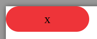
Close Button Text : This can change the text of the close button to X, Close, End whatever you want.


Close Button Position : This can align the close button left or right. You can change the position of the Close button.


Close Button Shape : This will change the shape of your close button and we can make the pop-up round, ellipse or rectangular.


Close Button Font Size : This will help in changing the text size of the close button.
Close Button Height & Close Button Width : This will help in changing the height and width of the close button.

Vertical Position : If you want to move the close button outside the popup it will help to move the close button vertically.

Pop-up Background Light-Box :
- Pop-up Background Color & Pop-up Background Opacity : This will change the pop-up background, you can change the color and opacity of the color.


- Pop-up Background Color & Pop-up Background Opacity : This will change the pop-up background, you can change the color and opacity of the color.
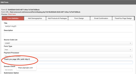
If you want to direct users to a specific page after the form is submitted, you can place the url into the "Thank you page URL" field.
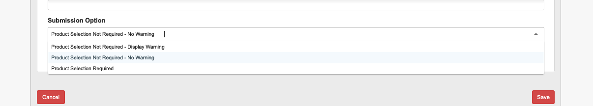
Select a submission option. Submission Option is a feature that allows ONEcount to require a user to subscribe to a product or package in order to submit the form. An example of where this might be used is when you e-mail a link to a subscription form for requalification of a controlled circulation product. Very often users will see their information pre-populated in the form, but won't check the box subscribing (or renewing) them to the product. This option allows you to either force the user to to subscribe to a product in order to submit the form, remind the user that he or she has not subscribed but allow them to continue anyway, or just accept the day with no warning and no subscription requirement.
Step 2: Define your demographic questions.
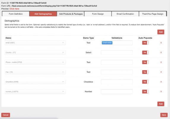
- Start by adding your first demographic questionin the Demo column. All ONEcount questions that are in your question inventory will appear in the dropdown menu list. You may also type the question name or number into the dropdown box to find a question to add.
- VALIDATIONS: If needed, select validation(s) to require a specific format for responses to this question. Allowed validations are: alphanumeric, date, email, email-match, or required field. Be careful with alphanumeric because it does not include any punctuation, meaning you could not enter (305) 555-1212. For the email validation, ONEcount only checks that the e-mail address matches an appropriate format; it does not validate that the e-mail address really exists. Email match presents two e-mail boxes to the user and requires that both entries match. This is a way to reduce data entry errors from people entering the wrong e-mail addresses in your forms. Multiple validations can be added to each question.
- AUTO POPULATE: You may choose to have fields auto populated for identified users by setting the auto populate switch to yes. This is the default. If your publication is audited and the rules of your audit require the user to enter a field manually, you can turn Auto Populate off for that specific field.
- To add additional questions, click the “Add” button in the top right hand corner.
- To remove a question click the “X” at the end of the respective row.
- You can not edit a row once it had been created; if you find an error, you must delete it
- The order of the questions on this page is not important.
- We have added Hide Option in this tab which will hide the selected values from multiple option types.for example if you want to show all the countries except "India" you can selet india in Hide option.

PHASE C: Add Products and Packages.
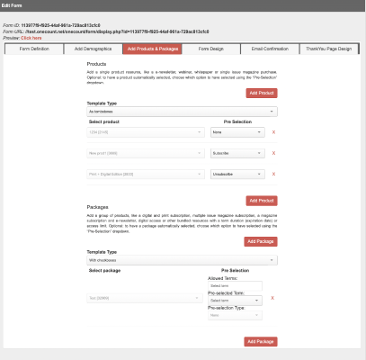
In this phase, you can add a single product or package, or a combination of multiple products and packages.
PRODUCTS: Add a single product resource, like a e-newsletter, webinar, whitepaper or single issue magazine purchase. Optional: to have a product automatically selected, choose which option to have selected using the “Pre-Selection” dropdown.
- Choose a template for how you want product options displayed. Examples of template types are in the images below. ********
- Select the first product you would like to include on the form. All the products created within ONEcount will appear in the product drop down. To search for a specific product, you can type the product name or ID number into the field.
- Preselection ********
- To add additional products- click the add product button in the right hand corner.
- To remove a product, click an X
PACKAGES: Add a group of products, like a digital and print subscription, multiple issue magazine subscription, a magazine subscription and e-newsletter, digital access or other bundled resources with a term duration (expiration date) or access limit. Optional: to have a package automatically selected, choose which option to have selected using the “Pre-Selection” dropdown.
- Choose a template for how you want Package options displayed. Examples of template types are in the images below. ********
- Select the first package you would like to include on the form. All the packages created within ONEcount will appear in the product drop down. To search for a specific product, you can type the package name or ID number into the field.
- Preselection ******** Term/Type
- To add additional packages- click the add product button in the right hand corner.
- To remove a package, click the X
Pre-selection of Products and Packages with query string
In order to preselect the terms via the query string, a comma-separated value of term ids can be passed as a query string on parameter name "terms". The respective packages for the given term ids should be present on the created form. The term ids can be appended on the URL as:
&terms=991,1002
Similarly, to preselect the products via the query string, a comma-separated value of product ids can be passed as well on parameter name "prods". The given product id should be present on the created form. The product ids can be appended on the URL as:
&prods=10001,20001
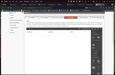
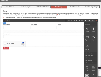
PHASE D: Designing the Form
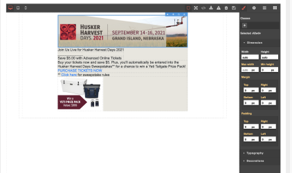
This is an example of a form built using the form builder.
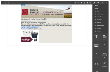
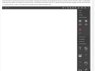
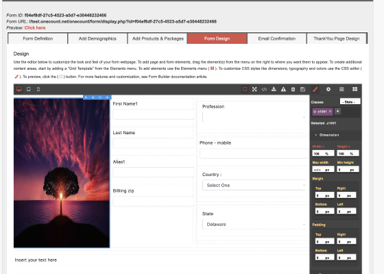
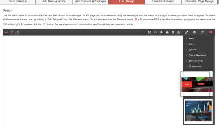
Use the editor to customize the look and feel of your form webpage. To add page and form elements, drag the element(s) from the menu on the right to where you want them to appear. Sections of the Elements menu can be collapsed for ease of use to drag in content blocks that are located lower in the menu.
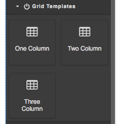
To create additional content areas, start by adding a “Grid Template” from the Elements menu.
BUILD FORMS FROM SCRATCH
Form Building is a multi-step process.
Form can be built from scratch. It requires, at the very minimum, a Captcha and Submit button, if building from scratch. If choosing to do so,
- Navigate to the 'Form Design' tab, after you have filled out the basic information as required by the 'Form Definition,' 'Add Demographics,' and 'Add Products/Packages' tabs.
- The canvas can be populated by dragging-and-dropping elements/components from the right-hand panel.
- Simply select your choice of component from the options in the right-hand panel with your mouse
- Drag it over to the spot on the canvas, as you prefer
Let's start with selecting a grid format from the 'Grid Templates' option in the right-hand panel. This helps with adding elements to the canvas, eventually your form, in an organized/disciplined manner.
Below is a screen-shot where the 'Grid Templates' expands on beings selected, and the 'three column' grid is chosen
- First, let's expand the 'Grid Templates' option by selecting it.
- From there, select the preferred column type, then drag it to the canvas, as shown below (three-column grid selected)
3. To populate the columns, let's choose from the 'Demographics' option.
-
- Select First Name and drag it to the left-most cell, followed by Last Name to the middle cell, next email to the last one.
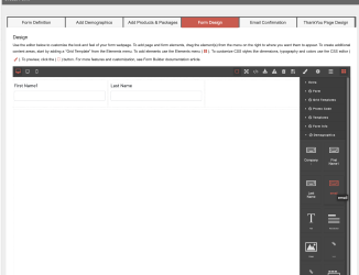
4. The three-column grid will look as follows:
5. To add Captcha to the form:
-
- Select 'Form' from the right-hand panel

- Select Captcha and drag it over to the spot on the canvas. In this case, we choose below the 3-column grid
- Select 'Form' from the right-hand panel
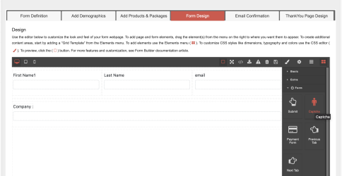
6. To add a 'Submit' button:
-
- Select it from the 'Form' option and,
- Drag it to the spot you prefer on the canvas,
- Eventually this position will impact how your final form is displayed)
7. Below is what the final form/pop-up will look like after the additions/modifications described in steps 1-7.
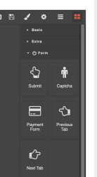
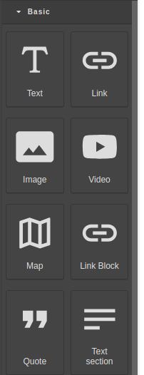
ELEMENTS MENU
To add elements, like titles, text blocks, images/logos, products/packages, or questions/fields use the Elements menu (image).
- Begin creating a layout by first adding Grid Templates. First add One Column Grid Templates to define the basic layout. For multiple columns, add a one column Grid Template before dragging 2 or 3 column Grid Templates into the form.
- To add a Title and Description, drag in the “Title” or “Description” content blocks from the “Form Info” section of the Elements menu. The “Title and Description” will be what you have entered during Phase 1, Form Definition.
- To create a custom heading or text block, add a “Text” or “Text Section” from the list of products near the lower part of the Elements menu.
- Click to view how you can add a Youtube video to your form.
- To add Products/Packages drag in the Product or Package from the Elements menu on the right. The layout of Products or Packages will be based on what Template Type you selected during Phase 3, Add Products & Packages.
- Adding Images, first drag the image icon from the Elements Menu and place it where you want an image to be placed.
- A pop-up window will open with a library of images already added.
- To add a new image, click the left-hand side of the image pop-up window. Using the folder browser, choose an image from your files that you would like to upload.
- After uploading an image file, select the image from the image library list on the right hand side.
- After selecting your image, click the “X” button to close the image library. Your image will be placed in the image content block.
- Here is a video showing how to select images to your canvas:
- To add Questions/Fields drag the questions you have selected during Phase 2, “Add Demographics”, from the “Demographics” section of the Elements menu.
- It is recommended to place each Question in individual Grid Templates (single or multiple column).
- To add additional questions, return to Phase 2 “Add Demographics”.
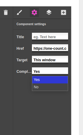
Once created, we can edit the added elements to the canvas. Let us see how URL links can be added and how to the 'paint brush' icon can be used.
- URL links can be added to components that use the 'Link' feature.
- To add or modify a URL link, use the 'Components Settings' option on the toolbar, denoted by a 'gear' icon
 on the above toolbar.
 - You can add URL to the 'Href' field, which will then link the selected component to the URL specified in this field.
- Please to view a video showing how to create a URL link.
- To add or modify a URL link, use the 'Components Settings' option on the toolbar, denoted by a 'gear' icon
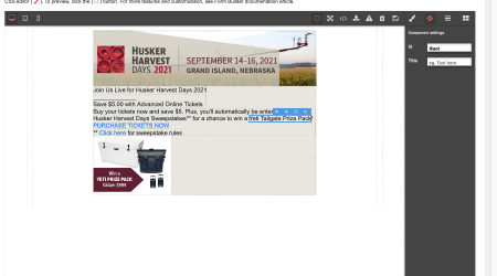
- Components can be modified in terms of typography(text-related features such as fonts, alignment), dimensions (height, width, padding, etc.) or background decorations (color, radius, etc.).
- To do so, select the component, then click on the 'paintbrush' icon on the above toolbar, denoted by
 . In the screen shot below, the image on the right is selected and edited.
- To do so, select the component, then click on the 'paintbrush' icon on the above toolbar, denoted by
b. Please to view a video showing how a button's background color was changed.
Click-Thru Button
Often users will want to create a pop-up or landing page that has a button that clicks through to another site or page. The specific use-case could be clicking to a partner site to download a digital edition, clicking to a non-ONEcount form, or clicking off-site to a thid-party application.
To create a click-thru button, click in the cell or grid where you want the button to appear, and from the tool-bar on the right, select Form Options, and then Submit. ONEcount will place a button on your form.
Now click on the button, and click on the gear icon above the tool bar.
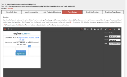
Click on the Action Pull-down and select Clickthrough. In the box for Label, add whatever text you would like to appear on the button. In the URL box, put the full URL where you would like the user to be sent when they click on the button. Please note that this URL will open in a new window, leaving the pop-up on the screen. The user will need to close the pop-up.
A future version of ONEcount will track these click-throughs as "completions" in both the form and segment analytics, giving you insights into how many people are clicking through to the URL.
Click-Thru Image :
Similar to button click throughs, we can also calculate completions on image click throughs. To setup this we need to use link-box and images
First we need to drag the link-box and the image inside it.
After this select link-box from layers or you can find it on canvas and go to gear button there you can see additional option called completions which by default is set as yes which means it will calculate completions , you can select "No" if you do not want to calculate completions.
Close pop-up after Action:
So click-through image and button popup will close automatically after redirecting to the target page and if you want to close the popup after any specific action like form-submission or clicking on an element, you can do the following: May use additional scripts.
setInterval(function(){window.parent.postMessage("closepopup", "*");},1000);
});
TEMPLATES MENU
The Templates menu contains a set of four pre-designed set of templates you can choose from. Clicking on the Templates option, (found on the right-hand panel) displays the template set.
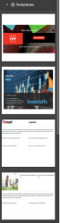
To use a template, drag-n-drop the preferred template from the right-hand panel to the canvas.
To drag-n-drop a template, first click on the 'Templates' option in the right-hand panel. This will display the templates. Now, choose a template and drag it to the canvas to the left, as shown below.
The various types of templates include:
- Three-column with graphic
- Two-column with graphic
- One column/graphic on top
- One-column graphic click-through
The Demographic components and other features can be added to the forms per the designated space provided in the chosen template.
The templates are designed to be responsive, that is moldable to the various screen-sizes. These can be used for either 'Forms' or 'popups.'
Please Note: For ease of use, please ensure the canvas is empty before the drag-n-drop.
STYLE MENU
To customize the design or CSS styles like dimensions, typography and colors use the CSS editor ().
- First, select which element you would like to modify. Elements can be designed at the Grid Template, Content Block, Product/Package, or Question level. Then click on the paint-brush tool on the upper-right nav bar of the form builder.
- Elements sharing common “classes” will be globally changed when edited. To edit the appearance of just a single content block either remove classes or select the element individually.
- DIMENSION: Edit the margin and padding size of content blocks or Grid Templates. Adjustments can be made by using either pixel or percentage.
- Click on the “px” or “%” to switch units.
- TYPOGRAPHY: Edit fonts, font sizing, font color, alignment, and other typographical styling.
- DECORATIONS: Edit background colors, borders of content blocks or individual elements.
- Make sure the Opacity Slider is set above 10% for color edits to be visible. It is recommended to move the Opacity Slider all the way to the right.
To alter the text of a button (like a submit, etc) select the button and click on the gear icon on the upper-right:
To preview, click the Preview link at the top.
Elements Menu: (add the four square image). The Component Manager
ADDING LINKS TO FORMS
- Select the text that you would like to hyperlink. Then click the hyperlink button () that appears last on the black edit bar.
- Next, deselect the content block.
- Now, click the linked text.
- Open the component settings by clicking the gear icon at the top. ()
- Paste or type the url destination for the link into the “Href” field. You may also add a title and specify a target for the link.
PHASE E: EMAIL CONFIRMATION
The Email Confirmation tab is used to fill out details of the confirmation email.
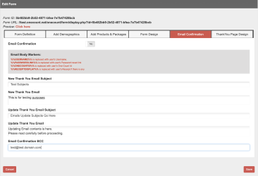
- Email Confirmation (Yes/No) is where you select whether a confirmation email will be sent upon subscription to/registration for any products listed on the form.
- a. Enter Acknowledgement Email Information. (See Items b-c below.)
- This is where you can create customized acknowledgement emails specific to the form/product attached to the form. Creating these customized emails is optional, as default acknowledgement emails not specific to any form and/or product are configured in the Configuration Manager.
- Enter the subject of the email in "New Thank You Email Subject" field.
Enter the content of the email in "New Thank You Email" field.
Body markers that may be used in the text are as follows:
%%USERNAME%% – will replace the body marker %%USERNAME%% with the subscriber's username.
%%PASSWORD%% – will replace the body marker %%PASSWORD%% with the subscriber's password.
%%ONECOUNTID%% – will replace the body marker %%ONECOUNTID%% with the subscribers account number/ONEcount ID.
%%RECEIPTDISPLAY%% – will replace the body marker %%RECEIPTDISPLAY%% with a receipt for purchase amount, if any. - Enter the content of the email in the "Update Thank You Email" field.
Enter the subject of the email in the "Update Thank You Email Subject" field.
Enter the email address for BCC in the "Email Confirmation BCC" field.
PHASE F: DESIGNING THANK YOU PAGE
The 'ThankYou Page Design' tab helps in designing a thank you page after form has been submitted.
Below is a screen-shot of the default Thank you page template, that is automatically populated in the 'Thank you Page Design' tab.
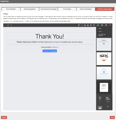
Up to four templates, that are drag-n-droppable, are provided in the right-hand panel. To view them, please click on the 'Thank you Templates' option in the right-hand panel.
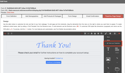
These templates can be further customized using the components from the form builder, such as the Submit button, Captcha, Demographics components, and such.
So, we now have three ways for designating a Thank you page:
1. Provide a URL in the 'Thank you Page URL' field found in the 'Form Definition' tab. This has priority over the following two steps (2. and 3.)
2. Choose a preferred template from the 'Thank you Page Design' tab. If step 1. is not provided, step 2. takes priority, if provided.
3. Using the default Thank you page. This comes into play if steps 1. and 2. are left blank. This is also what will be used for the older forms (that did not have the Thank You Page Design feature).
The older forms that did not have the 'Thank you Page Design' feature, will now include this feature so that the 'Thank you' pages are now customizable
The templates provided in the 'Thank you page Design' tab are responsive.
The default Thank you page looks as shown below:
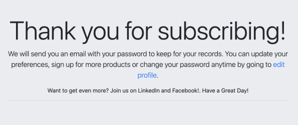
The default values in the Thank you page are populated from the Config Manager.
To delete a template from the canvas, click on the 'trash can' icon found on the above toolbar.
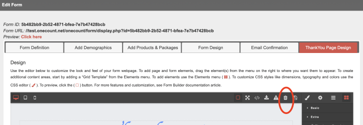
Please to view video showing how to select and delete a 'Thankyou Page Design.'
TO DUPLICATE A FORM
- From the “Manage Forms” page click the copy icon at the end of the row for the form you wish to copy. ()
TO EDIT A FORM
- Click the Pencil Icon () towards the end of the row of the Form that you wish to edit. ()
DELETING A FORM
- Click on the Trash Icon () towards the end of the row of the Form that you wish to delete. ()
Along with customization and new product templates it does:
- Registration
- Subscription, Unsub and Renew
- Login, Lookup
- Progressive lookup
- Smartlink login
- Redirect to landing and sending email after form submission
- Payment
CREATE LANDING PAGE FOR FORM:
To create landing page for form, select template type as Landing Page in form-builder Add Product & Package tab as shown in image below:
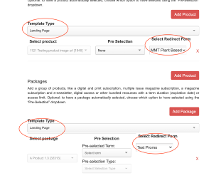
After selecting template type as landing page select redirect form from the drop down. Drag and Drop the package or product from blocks to the canvas from design tab. Below is the image of landing page design.
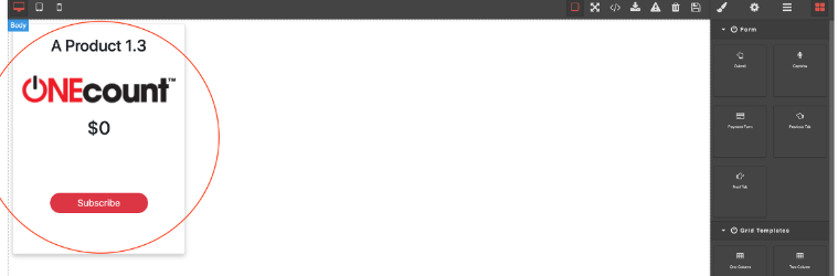
The images on the design is from the URL present to that package or product as shown in image below.
ADDING BRAND HEADER AND FOOTER TO FORMS:
There are two ways to add brand header and footer to form builder forms.
- You can add brand id at the end of Form URL to automatically apply brand header and footer for the form.
Ex: https://client.onecount.net/ /onecount/form/display.php?id=53464b88-c391-479f-82cf-e1cd19a870cd&brand=brandid
- By selecting a brand from the dropdown present in tab definition tab.
Once brand is selected you can drag brand header and footer from design tab and edit them. Editing brand header and footer gives flexibility to remove or change design or text for the particular form.
CREATING POPUPS USING FORM BUILDER:
These popups are used in action manager for targeting and for gating products. Below are the steps to create form which behaves as popup.
- Select the type of form from the dropdown in Form Definition tab.
- If form type is popup then popup config fields are displayed. Below are the fields which define behavior of popup.
- Popup Width - It define width of a popup.
- Popup Height – It define height of a popup.
- Popup Horizontal Position - It define the horizontal position of popup on screen.
- Popup Vertical Position – It define the vertical position of popup on screen.
- Popup Slide Position – It define from which side popup should slide before appearing on position.
- Popup Delay – It define how much time popup should take to appear on screen.
Prerequisite: As these forms appear as popup on the client site, you will need to add a CNAME record in your domain's DNS so that the pop-up and form code can be loaded from our servers into your domain. So if your domain is abc.com, you will need to add a CNAME record mapping oc.abc.com to <client>-reg.onecount.net. Then this is done, any request going to oc.abc.com will actually to go your registration server at <client>-reg.onecount.net for loading the pop-up code and setting cookies.
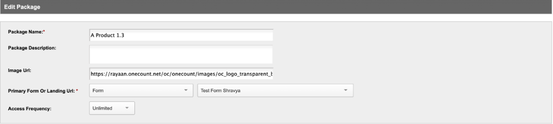
· Popup setup for gating: Once popup is created you need to create the Packages/Products for gated content. While creating the Package/product you need to select “Form” as “Primary Form or Landing Url” option. Then select the popup form created in the previous step. A text box will be displayed as below
You can use this to ensure CNAME set up is done correctly. This box will be auto filled with <client>-reg.onecount.net but If you need to gate a page or section on site abc.com then enter oc.abc.com in text box (because popup will appear on abc.com, This step is just for CNAME setup validation). If CNAME setup is not done, then it will throw warning while saving Product/Package. Also, the pop-up won't work on your site.
· Popup setup for targeting: Once popup is created you need to create the action in action manager. While creating the action manager select popup form created. If popup should appear on site abc.com then enter oc.abc.com in Target Domain. We will check if CNAME set up is done correctly, if not error will be warning.
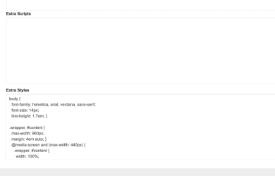
Extra Scripts/Extra Styles:
These boxes allow you to add additional Javascript code or CSS to your forms to alter the appearance or function of the form.
One use for these boxes is to add Javascript code to your form that will change the questions and/or question responses based on a user’s response to a question on the form.
ADVANCED FORM TECHNIQUES:
With Extra Scripts/Extra Styles, you can add features to your form or popup to enhance its look-and-feel as well as operations. Following are examples of how this can be achieved.
Example 1: Code for altering responses based on select type demographics:
Example: If a form contains a question which ask whether the user is a doctor or a patient. If the user selects doctor the demographic fields which are related to doctor will appear (type of specialty, NPI #, medical degree achieved, etc.). Otherwise, demographic fields for a patient will appear on the form. This modifications helps to show user only those demographic fields which are related to their previous answers.
Example Sample Code:
removeInitial = [1043,859,659,683,699,707,723,731,747,771,779,787,795,867,915,739,763,1059,1075,1083,1091,755];
var hcpObj = {
"dropDownId" : 1051,
"whenSelcectedItem" : [{
"Yes" : [659],
"No" : [683],
}],
"itemsDisplayWhenSelected" : [659,683,699,707,723,859,731,915,867,747,787,1043,779,771,795,739,763,1059,1075,1083,1091,755]
};
document.getElementById("q_id_1051").onchange = function(){autoDropDown(hcpObj)};
var hcpNoObj = {
"dropDownId" : 683,
"whenSelcectedItem" : [{
"Patient Role" : [1059,1211],
}],
"itemsDisplayWhenSelected" : [659,699,707,723,859,731,915,867,747,787,1043,779,771,795,739,763,1059,1075,1083,1091,755]
};
document.getElementById("q_id_683").onchange = function(){autoDropDown(hcpNoObj)};
Steps:
- Initialize removeInitial variable and pass an array of demographics ids which you want to hide when form is loaded.
- Create an object with any name and this object should contain 3 elements
- dropDownId – You need to pass an id of select type whose action must be taken.
- whenSelectedItem – You need an array of object this will be the response for the each select type from the dropdown. Key will be the response type and value will be the array of demographics id which should appear when this key is selected.
- ItemsDisplayWhenSelected – This is array of demographics id, ids which are hidden before selecting the action for the demographic select type.
- getElementById("q_id_1051") – 1051 will be the demographics id which will be same as dropDownId.
- autoDropDown(hcpNoObj) – autoDropDown() function is called and object which is created above will be passed as a parameter this function implements the response base altering the demographics.
Note:
- removeInitial is assigned only once at the beginning of the script.
- All the code must be included in form extra script area.
Example 2: Code for removing an option from the form
Example: A form contains a collection of questions. The client decides that a question/option needs to be done away with, but without disturbing the rest of the form. You want to have it removed or hidden. You can make this field invisible without changing anything else about the form, using the Extra Script option. Without re-designing the form, we are able to remove the unwanted option by using the sample code below.
Example Sample Code:
var removeId = document.getElementsByClassName("labelId");
for(var i = 0; i < removeId.length; i++){
if(removeId[i].innerText == "RemoveMePlaceHolder"){
removeId[i].parentNode.style.display="none";
}
}//end of for loop
Steps:
- Initialize a variable to grab all the instances of the id from the form you want hidden.
- var removeId = document.getElementsByClassName("labelId"); (notice the semi-color)
- removeId: name of variable (you can choose a name of your choice, but remember to be consistent with the use through the code)
- labelId: replace this with the id of the field you want checked/removed
- getElementsByClassName: property of javascript that allows you to get elements by the class name property
- Traverse through the array of the gathered instances (of removeId), and check for the corresponding text by comparing the innerText property to "RemoveMePlaceHolder"
- removeId[i].innerText == "RemoveMePlaceHolder" (check for matches)
- RemoveMePlaceHolder: replace this with the text you want hidden
- If a match is found, then grab its parentNode
- removeId[i].parentNode
- [i] is the index of the array where the match was found, during traversal
- Change the style of the parentNode to display it as none. This keeps the field hidden in your forms.
- removeId[i].parentNode.style.display="none"; (notice the semi-color)
Note:
- All the code must be included in the form Extra Script field.
- The code is to be inserted in the forms in which the value need not been shown or hidden
DYNAMIC/PROGRESSIVE LOOK-UP:
This is a feature provided by ONECount.
A check is performed after two pieces of data is entered in the form.
This check looks-up the database till a match is found. Once it does, the user is asked to confirm.
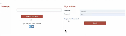
The user can choose to log in by clicking on the 'Lookup' link.
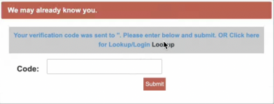
If the Lookup is clicked, the user is taken to the Lookup/Sign-in page, that may appear as shown below:
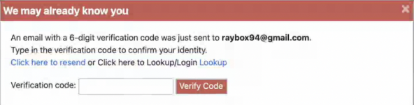
This is similar to the Verification Box that pops up if the 'Email Exists' tag is selected when adding Demographic 'Email'. A similar pop-up as shown below appears:
The Lookup link takes you to the login/sign-in page.